I ran a D2C jewellery brand out of WhatsApp, Amazon and Flipkart and Shopify, Then I designed the operations tool I never had.

Tathya was a real D2C artificial jewellery brand I founded and ran for two years. It sold through Amazon, Flipkart, Instagram and WhatsApp DMs with a payment gateway handling checkout and no owned storefront.
I ran it end to end: product design, photography, catalogue, packaging, customer communication, orders, supplier coordination and marketplace management.
Problem: About half of Tathya's orders failed. By my estimate, since the seller records are no longer accessible, roughly 20% came back used, 15% came back broken or swapped, and 12-15% were never delivered, mostly COD refusals and fake orders. Each return cost ₹45-60 in shipping on an average order of ₹284, and I never worked out why it kept happening because orders, customer chats and supplier updates lived in disconnected places.
Approach: Two years of firsthand operations, documented as pain points, then scoped into an operations dashboard.
My contribution: I was the operator who lived the problem and the designer who solved it
This case study is built on founder-led operational research: two years of running the business, documented as pain points and behavioural patterns. It is not built on interview or survey data, and I don't present it as such.
Strength | Limit |
|---|---|
Depth. I lived every failure and know which ones cost money. | One operator's view. Not yet validated with other sellers. |

Dashboard Home | Show what needs attention today across orders, stock and suppliers | All four |
Orders Table | One view of orders from every channel, with COD and WhatsApp orders handled explicitly | Missed COD orders, WhatsApp order confusion |
Inventory View | Real stock levels and low-stock warnings | False stock visibility |
Supplier Tracker | Track supplier commitments and flag delays | Supplier delays |
Returns Inbox | Flag failed and at-risk orders, COD refusals first, and record why each one failed | Returns, COD refusals, fake orders |
In scope, and the reason this exists: making returns visible. The dashboard flags failed and at-risk orders, COD refusals first, so I can see which channel, product and order type is driving them. Out of scope, on purpose: checkout redesign and any change to the marketplaces' own return rules. Knowing what not to redesign is the product decision.
Feature | Verdict | Why |
|---|---|---|
WhatsApp order parser | Added | Maps directly to WhatsApp order confusion |
Smart low-stock prediction | Added | Maps directly to false stock visibility |
AI chatbot | Rejected | Trend-driven. No documented pain point behind it |

I stripped away visual styling to focus on the operational logic. These wireframes let me check the information hierarchy, navigation structure and core workflows on paper before moving into high-fidelity design.
The visual system was designed around one principle: make operational decisions easier to see.
I used typography, spacing, components, and a purposeful color system to establish hierarchy and communicate status at a glance.

Success metrics the design is built to move (hypotheses to validate):
Metric | Pain point | How to measure |
|---|---|---|
Orders cancelled due to unavailable stock | False stock visibility | Cancelled-for-stock orders ÷ total orders |
COD orders confirmed before dispatch | Missed COD orders | Confirmed COD ÷ total COD |
Time from WhatsApp message to logged order | WhatsApp order confusion | Seconds per order |
Supplier delays caught before customer impact | Supplier delays | Delays flagged early ÷ total delays |
Failed or returned orders, by channel | Returns, COD refusals, fake orders | Failed or returned orders ÷ total orders |
What I'd validate next: run the dashboard past other D2C sellers to test whether my pain points are shared
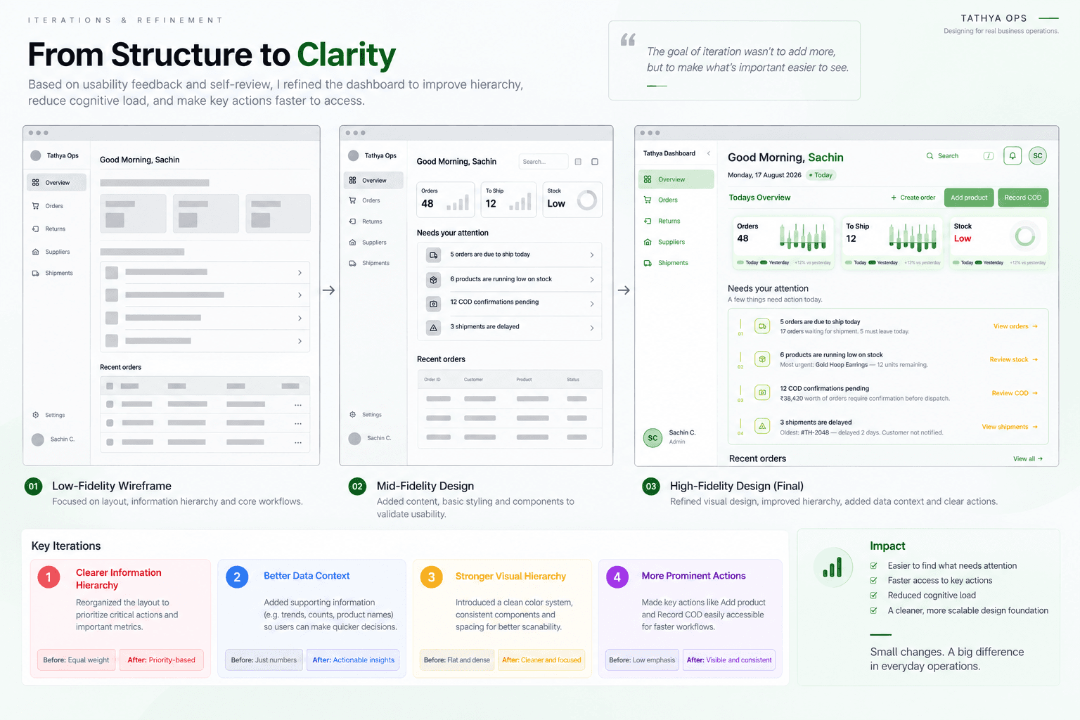
“From monitoring everything to knowing what needs attention.”
Key design decisions
01 — Action-first hierarchy
The “Needs your attention” section sits at the centre of the experience, making urgent operational issues visible immediately.
02 — At-a-glance overview
Orders, shipments, and stock are summarised through KPI cards so operators can understand the current state without navigating deeper.
03 — Context with every alert
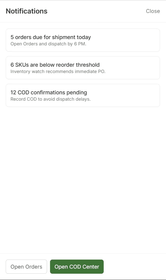
Alerts provide supporting information—not just numbers—so users can understand what happened and why it matters.
04 — Faster access to common tasks
Actions such as Create Order, Add Product, and Record COD are available directly from the dashboard.
05 — Consistent operational language
Status, actions, navigation, and data follow a consistent visual system to make the interface easier to scan.


Centralized
Orders, shipments & suppliers in one workspace.
Actionable
Exceptions are surfaced instead of buried in operational noise.
Scalable
A reusable operations foundation for Tathya's growing workflows.
Design for decisions, not data
An operations dashboard can easily become a collection of tables and metrics. I learned to ask “What decision does the user need to make next?” and design the interface around that action.
Exceptions deserve priority
Not every piece of information needs equal visual weight. Delayed shipments, pending COD confirmations, and low-stock items need to stand out because they require intervention.
Context reduces cognitive load
Showing an order status alone isn't enough. Connecting orders → shipments → suppliers → operational alerts gives the operator the context needed to understand what is happening.
Real business experience is valuable UX research
Because Tathya was a business I had actually operated, I could identify problems from real workflows rather than designing a dashboard around assumptions. It taught me to translate messy business problems into structured product problems.
Simplicity is a systems problem
Keeping the interface clean wasn't simply a visual decision. It required deciding what belongs in the primary workflow, what should be secondary, and what can be surfaced only when something needs attention.
Next, I would move from prototype to validation — testing the core workflows with real operators, iterating on their feedback, connecting real operational data, and measuring whether the system actually reduces the effort required to manage day-to-day operations.