a mobile-first billing experience designed to help shop owners create bills, track udhaar, and share invoices with less friction.
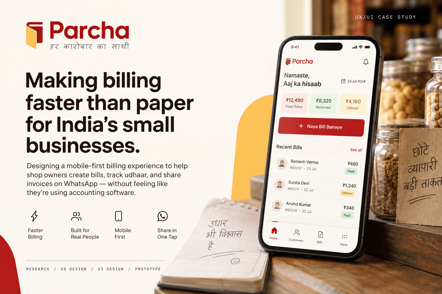
Parcha — Faster than paper, simpler than accounting.
Parcha is a mobile-first billing and invoicing app designed for Indian small business owners—especially kirana stores, hardware shops, garment sellers, electrical wholesalers, and local traders.
Many shop owners still create bills on paper, calculate totals manually, remember customer-specific prices, and track udhaar separately. Parcha brings these everyday workflows into one simple mobile experience without making the product feel like traditional accounting software.
⚡ Faster than paper
Bill-first flow, built for the counter.
🤝 Built around trust
Clear payment & udhaar states.
📱 Made for busy shops
Simple, one-handed mobile UX.
For many Indian small business owners, billing is still a fragmented, manual process.
Creating a bill often means writing on paper, calculating totals manually, remembering customer-specific prices, and tracking udhaar separately. Digital alternatives can introduce the complexity of accounting software, slowing down a task that needs to happen quickly in a busy shop.
The opportunity:
Design a mobile billing experience that feels as fast and familiar as paper, while giving shop owners the clarity and reliability of digital records.
How might we help small business owners create, manage, and share bills quickly—without adding the complexity of traditional accounting software?
I explored how small-business owners create bills, track udhaar, and share payment information using synthetic research: personas I built myself and interviewed one by one with AI, not real participants. I then translated those behaviors into opportunities for a faster, simpler billing experience.
1 User Persona
Rohit Sharma, a small-business owner who needs simple invoicing and payment tracking.
6 Key Behaviors Identified
From manual billing and customer-specific pricing to udhaar tracking and WhatsApp sharing.
4 Core UX Priorities
Speed, simplicity, trust, and one-handed usability shaped the product direction.
Billing is a speed problem. Shop owners are used to rough paper, mental calculations, and basic calculators.
Customer-specific rates live in memory. Repeat customers often don't need a full product/catalog workflow.
Udhaar is part of the everyday workflow. It shouldn't be hidden inside a separate ledger experience.
WhatsApp is the natural sharing layer. Customers often need bill proof immediately after a transaction.
Trust matters more than feature count. Users need transparent totals, reliable saving, and the ability to correct mistakes.
Busy shops demand one-handed interaction. Large touch targets and minimal screen switching became core UX requirements.


Exploring how billing could become faster without becoming more complicated.
I explored multiple directions around the core behaviors identified during research—fast item entry, repeat billing, customer selection, transparent totals, udhaar, and WhatsApp sharing. The goal was to reduce unnecessary steps while keeping the experience familiar to shop owners.
3 Ideation Principles
01 — Speed over features
Prioritize the actions shop owners perform repeatedly instead of adding a full accounting workflow.
02 — Familiar over complex
Use familiar concepts such as Naya Bill, Udhaar, Recent Customers, and WhatsApp rather than introducing unfamiliar accounting terminology.
03 — One task at a time
Keep each screen focused on one primary action, with large touch targets for quick one-handed use.

I mapped the complete billing journey to identify unnecessary steps and decision points. The final flow prioritizes speed, repeat behavior, transparent totals, and immediate WhatsApp sharing—while keeping Walk-in customers and Udhaar as first-class scenarios.

The wireframes helped reduce the experience to one clear action per screen—without sacrificing the flexibility needed for real-world billing.
Turning the billing flow into a fast, predictable experience.
I translated the user flow into low-fidelity wireframes to test the information hierarchy, screen sequence, and placement of primary actions before moving into visual design.
Clear hierarchy
Kept the customer, items, and total easy to scan during a busy transaction.
Faster input
Explored recent items, quick quantity/rate entry, and minimal screen switching.
Persistent total
Kept the grand total visible so users can verify the amount at any point.
Simple completion
Tested direct Paid / Partial / Udhaar actions and a clear path to WhatsApp sharing.

Testing the experience before calling it finished.
I turned the high-fidelity screens into a clickable prototype and walked through the complete billing journey to check whether the experience felt as fast and predictable as intended.
01 — End-to-end billing
Home → Customer → Items → Summary → Payment → Save → Share.
02 — Speed & friction
Checked whether a user could quickly find customers, add items, review totals, and complete a bill without unnecessary steps.
03 — Payment states
Walked through Paid, Partial, and Udhaar as clear completion choices.
04 — Error recovery
Checked editing, correcting quantities/rates, and avoiding accidental data loss.
05 — Sharing
Checked that Share on WhatsApp was an obvious next action after saving.
Simplified the Billing Flow
Reduced unnecessary steps and kept the journey focused on Customer → Items → Total → Payment → Save.
Made Key Actions Obvious
Prioritized Recent Customers, Walk-in, Paid / Partial / Udhaar, and WhatsApp Share so users can complete a bill without hesitation.
A billing experience built for speed, clarity, and trust.
Parcha brings the complete billing journey into a simple, mobile-first flow—helping shop owners create bills quickly, record Paid / Partial / Udhaar, and share the final bill through WhatsApp.
Design focus:
Fast to use · Easy to understand · Familiar to Indian SMBs · Trustworthy with money


Parcha’s final experience focuses on reducing friction in everyday billing—helping shop owners move from customer selection to a saved, shareable bill through a simple, focused flow.
Faster billing
A bill-first flow, recent customers, and quick item entry reduce unnecessary navigation during busy transactions.
Greater payment clarity
Paid, Partial, and Udhaar are treated as clear transaction states, making the outcome of each bill easier to understand.
Less friction after billing
The experience keeps WhatsApp sharing close to bill completion, reflecting how shop owners commonly share bill proof.
Designing for real-world behavior, not ideal workflows.
Speed is a UX requirement
For repetitive tasks like billing, every extra tap and screen adds friction. The experience needs to match the user's existing mental model rather than forcing them to learn a new workflow.Simplicity requires deliberate decisions
Removing features can be as important as adding them. Parcha became more focused when the experience prioritized billing instead of trying to behave like a complete accounting system.Trust needs to be designed
When money is involved, users need to understand what the system is doing. Clear totals, payment states, editable information, and visible save/share states help build confidence.Context changes the interface
A busy shop is different from a quiet desktop environment. One-handed use, interruptions, familiar terminology, and quick actions all became important design considerations.
Taking Parcha from a concept toward a real product.
Build & validate
Turn the prototype into a functional Android experience and test the core billing flow with real shop owners.Improve the billing loop
Use real shop-owner feedback to refine item entry, customer selection, payment states, and WhatsApp sharing.Expand selectively
Explore future needs such as richer udhaar management, repeat billing, and additional business workflows—without losing Parcha’s core principle of “faster than paper, simpler than accounting.”The next phase is not about adding more features. It is about validating the core experience in the real world and improving what shop owners use every day.

